Presentation of Kolormondo at Pitti Uomo 88
ENG
The Swedish Spot this year was hosted by the stand of Marshall, a historical Swedish brand for music and acoustics. There, I attended a very presentation, that was about an interesting topic for interior designers as well as for stylists, the creation of a new color system tool comparable but alternate to Pantone, called Kolormondo.
The project creator, Nicoline Kinch, gave a very fascinating speech about its conception and launch, and now I’m very curious of seeing how this product for visual and design will be perceived by its natural audience.
The aim was creating an instrument for working with all the color families that can also develop our creativity, this is why it has a spherical shape.
I must say that it is also a beautiful furniture complement, and it is disposable in many dimensions.
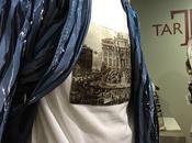
Besides, it was part of a beautiful installation at Padiglione Centrale, this is because it actually was in connection with the Pitti Uomo theme of this year, the color.
Kolormondo
Testo in italiano dopo le immagini

Kolormondo comes in many sizes

At the Marshall stand in Pitti 88

Marshall headphones and Kolormondo
ITA
The Swedish Spot al Pitti Uomo 88 quest’anno era ospite di Marshall, che è un marchio storico svedese dell’acustica.
Ho assistito a una presentazione davvero interessante, soprattutto per interior designer e stylist, sulla realizzazione di un nuovo sistema di colori analogo ma alternativo a Pantone, che si chiama Kolormondo.
La sua creatrice, Nicoline Kinch, ha tenuto una presentazione davvero affascinante, e in effetti io sono curiosa di vedere come sarà la risposta a questo nuovo prodotto per lo styling.
l’idea era quella di un o strumento per lavorare con le famiglie di colori ma anche per sviluppare la creatività, ed ecco il perché di una forma sferica.
È un bellissimo oggetto di design ed è disponibile in molte dimensioni.
Fra l’altro è stato protagonista di una bellissima installazione nel Padiglione Centrale. Effettivamente era in sintonia con il tema del Pitti di quest’anno, il colore.
Kolormondo