Today I propose a game to make you understand
better what I mean by change of direction:
look at these pictures.
What do you think they have in common?
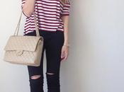
I love the linearity, the cleaning of the spaces, the warmth that you can only get
thanks to the natural color of the wood, you can see something white in the sofas or light walls?
The answer is no ...
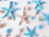
There are hearts, lace, angels, written cantari in abundance?
No.
That prevents this is the furniture that I like, simple, personal, natural and not tired
in time or take your breath away.


Ora guardiamo queste... Il bianco la fa da padrone, i pizzi abbondano, non parliamo dei fiorellini, e cosa dite della parete con i cuori in vimini e la scritta enorme? Mi schiacciano, soffocano, non resisterei cinque minuti.... L'unica immagine che potrei salvare è il salone con le bandierine, ovviamente se non ci fosse il bunting, che adoro come elemento decorativo, ma non usato così e se ci fossero più legno e meno tinte pastello. L'immagine con i vasi bianchi e i nomi è esplicativa: un vaso così in lavanderia o in cucina è bello ma non in quel contesto, per non parlare dei candelieri e del cantaro bianchi, ecco prima li avevo anch'io fino a che non mi sono accorta che sono kitch, sono finti, almeno fossero pezzi originali, e danno pesantezza all'ambiente.
Now look at these ...
The white man is the master, lace abound, not to mention the flowers, and
What do you say of the wall with wicker hearts and the word big?
I crush, stifle, not resisterei five minutes ....
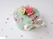
The only picture I could save is the living room with the flags, of course, if there were
the bunting, which I love as a decorative element, but not used so
and if there were more wood and less pastel shades.
The image with the white vases and names is explanatory: a vase so the laundry or kitchen
is nice but not in that context, not to mention
stanchions and sang white
here is the first I had too until I realized that are kitchy,
are fake, at least they were original pieces, and heavy damage to the environment.


 source
Spero di non aver offeso nessuno con questo post, ho solo espresso meglio quello che vi ho accennato nel post di lunedì sul cambio di rotta di stile sia del blog, sia mio. Buona giornata!
Hope I have not offended anyone with this post,
I just expressed better what I mentioned in the post on Monday
change of course and style of the blog, it's mine.
Have a nice day!